Wednesday 30 March 2011

Editorial Final Illustrations

Earlier this week I posted a rough and one version of an editorial illustration I've been working on, for an article about beating lie detectors. The deadline was yesterday so I've posted below the two versions I had to choose from and also one of them in context (dropped into the magazine layout).
The first one is a more finished version of my original idea, showing the guy playing the wire game, and the machine being unplugged. In the second version I tried a different take on it by having the polygraph reading going through the different parts of his body that readings are taken from during a polygraph test. These were the heart and lungs for heartrate and breathing, the mouth for the spoken answers, and the brain which controls all responses. I also like the idea of the wire game so I incorporated this into the illustration, so he's literally playing 'mind games'. 
I also had a go at making the lines a bit thicker in the second version to make them more obvious, but I'm not sure which I like better. The illustration in the layout is pretty big, 26cm square, which I think can handle the smaller lines, but the bigger lines perhaps make it that much more obvious and easy to understand. Feel free to let me know what you think...


William Goldsmith

I recently eyeballed a cool graphic novel by William Goldsmith entitled 'Vignettes of Ystov'. The illustrations were really lovely; a mix of freely painted characters and landscapes, and some nice structured hand drawn type and shapes. The illustrations have a free, quickly painted quality about them with visible brush strokes, and I particularly like the hand drawn geometric style type. I've posted some examples of his work below and don't forget to check out his website here. Enjoy.


><><><><><><><><><><><><><><><

Friday 25 March 2011

Editorial Illustration

For the past week I've been working on an editorial illustration for an article about cheating lie detectors.
We had to choose existing articles from magazines to illustrate or re-illustrate, and mine had a simple photo/collage type illustration of someone hooked up to a lie detector machine, so I wanted to create something hopefully a little bit more interesting. 
I ended up with an idea of having someone playing one of those electric wire puzzle games where if you touch the wire with the loop it buzzes and you have to start again, as it followed the pattern of the read outs given from a polygraph machine (lie detector). It also represents the article about being able to lie and get away with it, in the sense that it looks as if he is playing along on the level but he's actually cheating as the machine isn't plugged in.
Anyway, I've posted my rough and the practically finished version of this idea below, but I'm hopefully going to have a go at some different ideas before the deadline, as it was recommended I try and be a bit more abstract and do something a bit more visually interesting. 
So take a butcher's below and feel free to leave me a comment letting me know what you think! 


Monday 21 March 2011

Dan Matutina

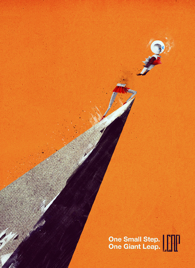
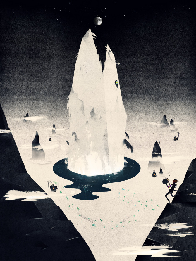
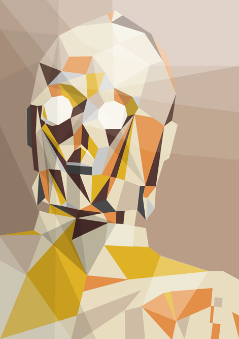
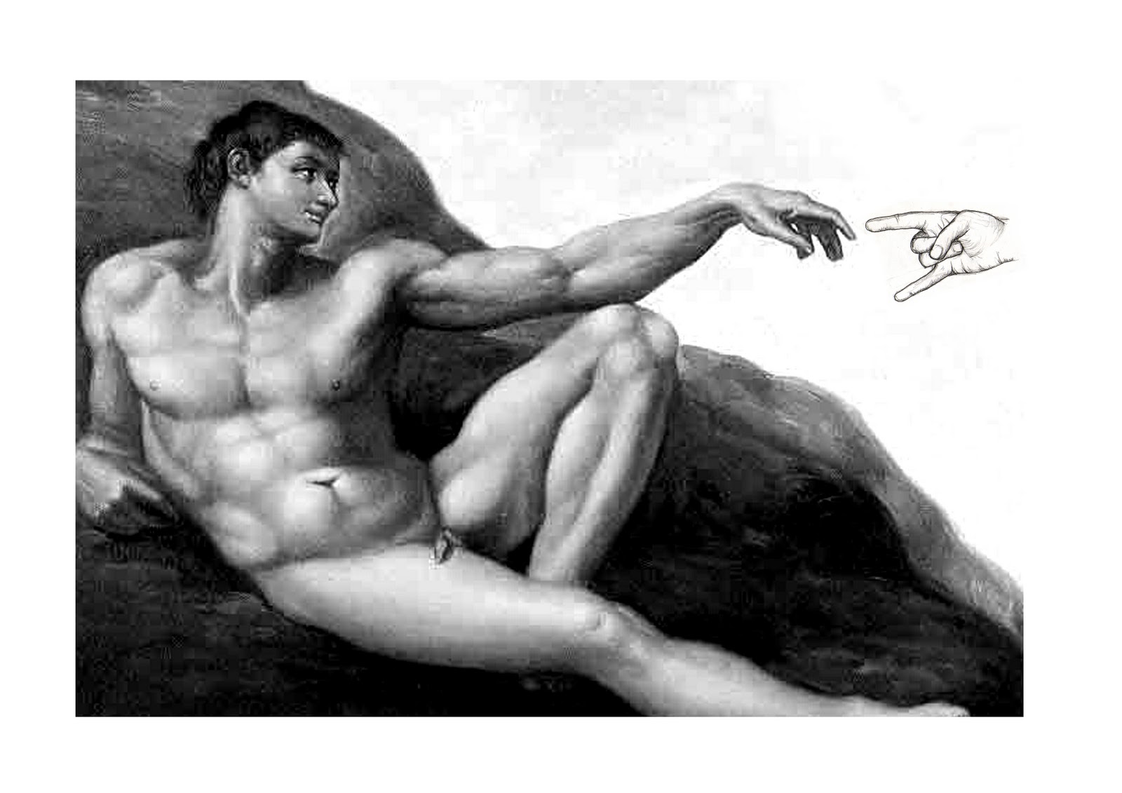
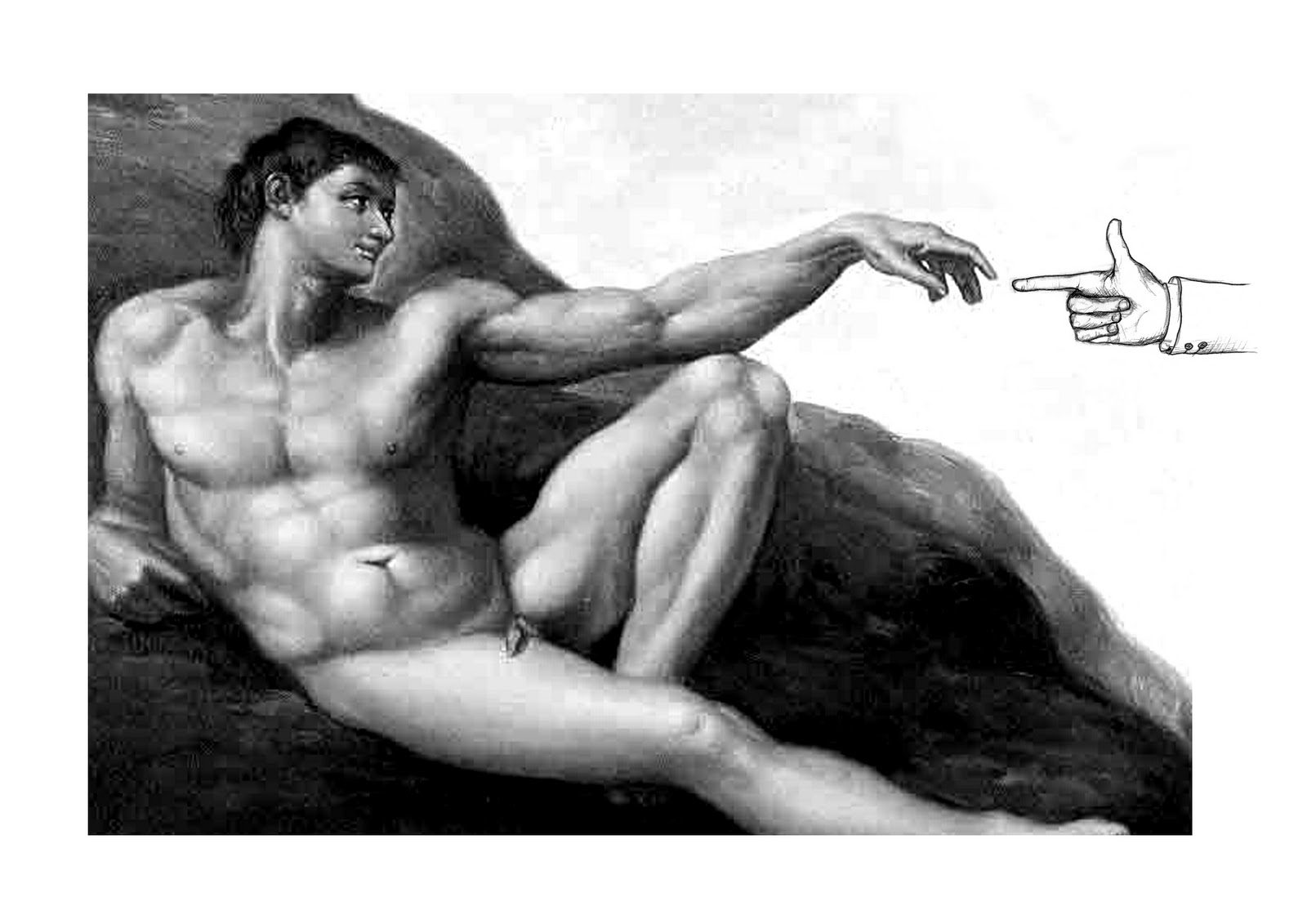
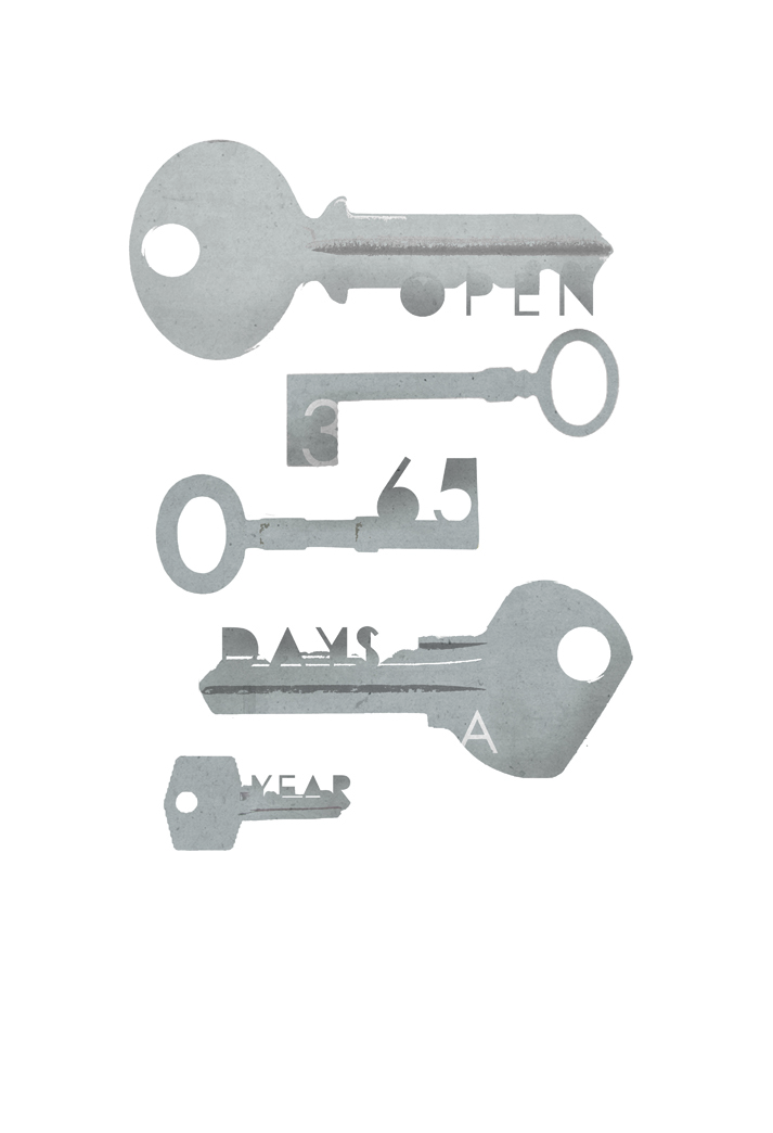
Dan Matutina is one of my favourite illustrators at the moment; his work is a cool mix of digital and hand made elements, and often has a lovely filmic quality to it. He describes it himself as 'a mix of clean & dirty, modern & old', and this can be seen not just in the look of his work but also the content, which often involve imaginative stories and references to science fiction and myths. 
Dan was kind enough to answer a few questions for me, and I've posted his answers below with a few examples of his work for you to get your peepers on. Cheers Dan!


1. How did you get into design/illustration?
  
I started illustrating and “designing” when I was small. I used to vandalize the wall of our house with my “artworks”. Haha. :) I did a bunch of illustrations and comics in grade school and high school. I formally learned how to design and illustrate when I took up Fine Arts in college. 


2. Some of your work has a cinematic look about it, particularly your sci-fi related pieces, is film one of your inspirations? What else inspires you?

Yea, film has always been a big inspiration when I make illustrations. I try my best to make it cinematic. Film was my first love when I was in College (at the UP College of Fine Arts). My love for film started when my group got a film grant to produce a short film for our Electronic Media class. It was one of  the most exciting experiences I had in my college life. I had my internship at the Film Institute where most of the Philippine independent film-makers came from. I was exposed to different films from different countries and it had a lasting effect on me. 

3. Your works are often based around sci-fi / mythological stories or themes. Such themes are often a playground for the imagination, is this what draws you to them?

I’ve always loved science and science fiction back in high school. The high school I went to had a strong focus on science & technology. As for the interest in mythologies, it came from growing up in the province (an hour flight from the capital). In my childhood, my grandmother would share different folk stories and myths. I get the themes of my works from the stuff I liked in my childhood: sci-fi and myths. 


4. Did you spend a lot of time developing your 'style'/ working method or did in come quite naturally to you? Is it how you've always worked?

The style just eventually came. I have contradicting tastes & likes, so discovering my style just happened when I was trying to balance these contradictions. Having said that, I think I can still push it a bit more. 

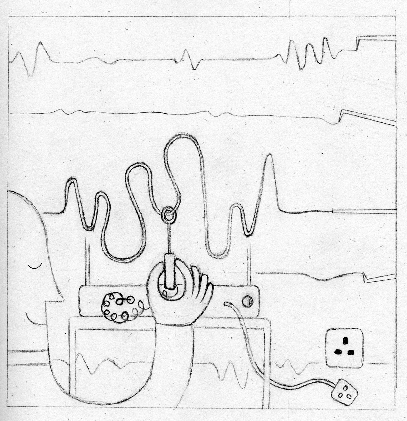
5. Your work often includes really nice use of textures, marks, ink splatters etc., how much of this do you create digitally, and what draws you to the blend of natural and digital?

Most of the textures, brush strokes & spatters are hand made. I scan and apply them on the digital illustrations I make. I like the crisp, clean look of digital illustrations and hand painted water illustrations. So I thought, why not combine them? 


6. How do you go about coming up with ideas for briefs/projects? How do you get through a creative block? (if you get them!)

Most the ideas for my personal works come from experience. It’s always fun to get ideas from experience because they can be very unique. For client works I research the topics first and then think of different ways to answer the brief. Yea, getting a creative block is part of every creative person’s life. When it hits me, I try to relax, drink coffee, read a book, surf the net, play video games or travel. 


7. When creating an illustration do you work on your own or in a studio with others? Do you think it helps your creativity to be around like minded designers/students?

It depends. Sometimes I love working by my lonesome & sometimes it’s great to be with other people. Yea, it’s a big help to be with other creative friends. You can consult ideas, ask for their honest opinion and share stories. There are times when it’s better to work on your own. This particularly happens when I think about initial ideas for a new project. 


8. Finally, what advice would you give to aspiring designers or illustrators? 

Take risks! Take risks with your design and career decisions. When things become too comfortable it means there’s something wrong. Use the internet to your advantage. Share your ideas with other people & collaborate with them. Be open to criticisms because you can only improve from them. And more importantly, have fun. :D


><><><><><><><><><><

Sunday 20 March 2011

Liam Brazier

Spotted some really cool illustrations by Liam Brazier the other day. The images are all created using straight lines and shapes, with a kind of modern cubist look about them. Notice the really nice use of colour and subtle changes in the block colour to suggest the curves and shadows. And they're of Star Wars characters and superheroes! What more could you ask for!  
I've posted a few examples below and check out his website here for more.


Saturday 12 March 2011

The Creation of Adam... and Metaphors

On Tuesday we were set a bit of homework to create some quick visual metaphors, by swapping in different hands, or different people/objects, into the painting 'The Creation of Adam' by Michelangelo. I've posted below some of my roughly photoshopped in hand versions for you to get your peepers around, that hopefully create some interesting metaphors of some sort, but I'll leave that up to you. Feel free to send in your answers on a postcard to......


Thursday 10 March 2011

Final Wellspring Piece

So we have reached the deadline for the Wellspring project newspaper, and I have to say everyone's work for it is looking fantastic! Can't wait to see it in print.

So my page was about about the centre being 'open 365 days a year'. I decided to keep mine quite simple and typography based, using keys to have that link to openness and doors being open. 
It didn't really change much from my digital rough really. I scanned it a lot of different keys to play around with and swapped some different ones in to have a range of different shapes. I also added some different textures and played with the shading to give it more contrast on the white background to make it less flat and stand out. There were a few changes with the type to make it more readable, and then the addition of a few small shapes in the keyring holes to represent some of the different aspects/services of the Wellspring centre. I wasn't to sure if it was better or not with these shapes added because I didn't want them to be too obvious,  but we went with it in the end as it just added another layer and made it more interesting. I've posted both versions below along with the rough.

I'm pretty happy with the final piece. There was a point where I was seeing other people doing these really gorgeous full images with people and type etc, and it made me worry that mine was too simple. But I kind of realised that I had a different concept and I think I took it as far as I could. Mine is primarily about the type I was given and I wanted to get it on there BIG, and just wanted to find an interesting way of showing it. It is quite simple, but it's a simple idea. Also I think it's good that it doesn't really lose anything with being in black and white, which is something I kept in mind all the way through. I think it should look ok if it doesn't print out too dark. 
There will also be a small text box added at the bottom, and a name credit at the side, so I'll try and post that if I can get a copy.
Finally, we'll be trying to sell a few of these soon, with all proceeds going to the Wellspring, so keep yours peepers open! 24 full page illustrations - bargain!


Give 'em a click to make them bigger

<><><><><><><><><><><>


Things I have learnt...

Im running a bit late with this, but a few weeks ago after coming to the end of our studio work on the competition briefs (mine being the James and the Giant Peach cover), we were asked to fill in a little sheet about our motivations and things we have learnt. I've posted mine below.

What motivates me :

Looking at the work of others and hoping to come up with something as good myself. - I spend a lot of time looking through other peoples work and trying to pick out which things I like about it. I think sometimes when on a piece constantly, you can get to close to it and lose a bit of perspective. I think stepping back and having a quick look around at some different work helps me to make decisions about my own work, and often gives me something to aim for. I always have the feeling that I could do better with my work, and although you want to feel happy with it, I think it's probably good that I want to do better because it means I'm constantly looking for ways to improve.

Things I have learnt :

1. Always push things a step further, as you can always go back.
- This something that I've learnt during the book cover module. I think there came a point where I'd thought I'd probably finished, and then someone would say 'take it further' or 'try this' and after taking their advice I think the piece got better, and even if something didn't work at least I'd given it a try and wasn't left wondering if it could have been better had I tried it. If that makes sense. 

2. Start work earlier as it gives more time for playing and editing.
- For the book cover project, I think it was the first time I actually finished before the deadline and had had he chance to play around and make some edits because of the extra time. I usually spend a lot of time thinking about what I want to do but not actually doing it because I'm worried that it's going to go wrong and not work out. I did spend a few days just staring at my roughs and wondering what to do, but there came a point where I just got on the computer and put together the majority of my front cover in literally a couple of hours. I usually put things off because I'm worried I'm going to waste loads of time putting something together for it not to work out. Particularly because I don't feel I've really found a way of working that I'm comfortable with / produces the results I want. 
But as the main parts of the cover came together quickly, it mean't I had more time to add bits and build it up, and it gave me more confidence to just get stuck in earlier because even though it might go wrong; it also might go right.


<><><><><><><><><><><>

Sunday 6 March 2011

Alien Corset

We went down to the Richard Goodall Gallery in Manchester last week and and there were absolutely loads of really cool posters on display/for sale. I always love having a look around the gallery when I go into Manchester.

Anyway, they had for sale there these really cool film posters by Alien Corset aka David O'Daniel, who creates screen printed posters for the Castro Theatre in San Fransisco. The theatre is a really old cinema built in 1922 and primarily shows old films. 
I really love these sci-fi futuristic posters that David created for a triple showing on one night. The circuit board type pattern and the simple idea of just showing a character or a few elements is really cool, and looks particularly good when printed in black and silver. Give 'em a click to make them bigger, and check out David's blog here.