

Friday 30 September 2011
HUGS Christmas Book
So my pitch went well, and I'm going to be illustrating a children's Christmas book for the charity Helping Uganda Schools. The book should be going to print at the end of October, in time to sell for Christmas. So for now I'm working on the imagery and design of the book, and we are also trying to generate interest and find people or places who might want to buy or get involved in selling the book. All proceeds from the book will be going to the charity, so spread the word! If you know any people, or have any contacts at shops, schools or local businesses that might want to buy or sell the book, get in touch! I've posted some promo information below, give it a click....

Tuesday 20 September 2011
Childrens Book Project
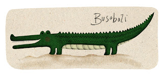
So over the past week I've been working on designing some characters and example pages for a children's book as part of a uni project.
The story revolves around some animal characters in Uganda who learn about Christmas and what it celebrates. The book is being made and sold in aid of a charity called Helping Uganda Schools, which raise money to support and help people build schools in Uganda, among other things.
The project was open to everyone in our class, and a good few people designed characters and pages, and we all presented our work to the charity on Monday. Unsurprisingly there was some really great work produced by everyone and it was cool to see all the different ways people had interpreted the characters.
Anyway, we don't know just yet who'll be given the job, but in the meantime I've posted some of the stuff I made for it below. Given some more time there would definitely be some things I would have changed about these, and some things that needed adding, but you kind of get the gist....


><><><><><><><><><
Sunday 11 September 2011
Erik Nitsche
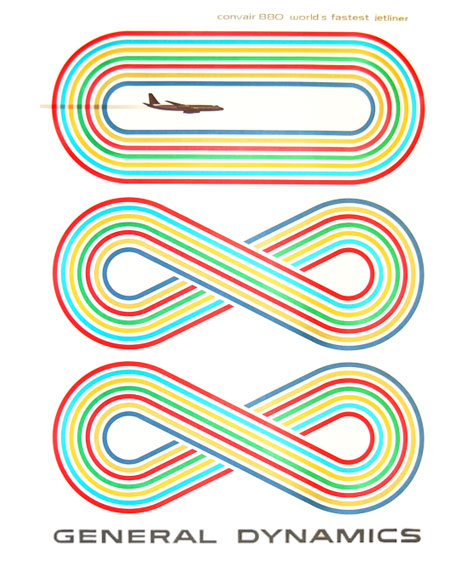
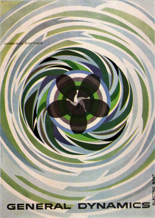
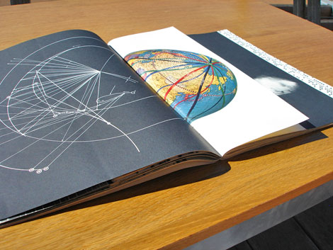
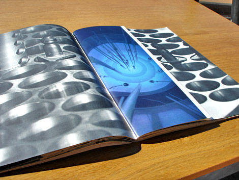
I recently came across some awesome graphic work by Swiss graphic designer Erik Nitsche. In the 1950's and 60's Nitsche was art director for General Dynamics, a U.S. based defense contractor, and created lots of work for them including their branding, advertising, books and posters.
His work is very Bauhaus inspired, and makes use of bold geometric forms and strong colour. During the cold war his designs often included aircraft, rockets, satellite's and submarines, and many often depicted space and space exploration, so these have all been interesting to look at for me as part of my research for my Lunar space project. Check out some of his work below, and some book photos courtesy of grain edit. Enjoy.


><><><><><><><><
Tuesday 6 September 2011
LUNAR : Astronaut #2
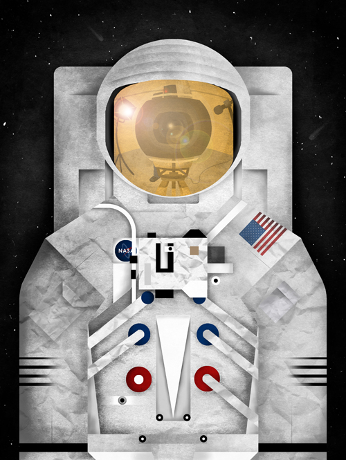
Because of all the reasons conspiracy theorists have come up with to disprove the moon landings, they therefore came to the conclusion that the actual moon landing (many claim that they did take off into space but never reached the moon) was filmed on a set at a secret location. Possibly by Stanley Kubrick....
Anyway, I took advantage of the reflective visor and added in a film camera, light and boom mic, and tried out a film still-like crop as if taken through the camera, with slight adjustments for composition. I think I'll will probably change the framing or expand on the background, as well as sorting out some of the details, even if I don't use this for anything further down the line. So, for now.....


Anyway, I took advantage of the reflective visor and added in a film camera, light and boom mic, and tried out a film still-like crop as if taken through the camera, with slight adjustments for composition. I think I'll will probably change the framing or expand on the background, as well as sorting out some of the details, even if I don't use this for anything further down the line. So, for now.....

Saturday 3 September 2011
Do Androids Dream of Electric Sheep?
So, at the moment I'm working on both my personal project around the moon landings, and also my dissertation which is focused on the film 'Blade Runner' (not very original I know) amongst other things, and because of the space/sci-fi nature of both projects, there has been some crossover in my research. For example, not long ago when I was researching into sci-fi posters for my space project, I came across this stunning book cover design by Justin Mezzell, submitted as part of the Re-Covered Books project, run by Bobby over at The Fox Is Black design blog.
The design is a new cover for the book 'Do Androids Dream of Electric Sheep?' by Philip K. Dick, which is the book that the film 'Blade Runner ' is based on. I absolutely love everything about this design. I love the sans-serif type used which has that retro sci-fi poster look about it; streamlined and futuristic. The limited palette of colours used are also great, slightly sombre and also creating nice contrast between the elements. I also love the central alignment and symmetry (for the most part) of the design, something I'm quite drawn to; it's incredibly balanced.
The circles used look as if they could represent eyes, a key feature in the book as the eyes are used via the Voight-Kampff machine to find replicants; and also have a slightly celestial, planet-like look about them which links nicely to the on-world/off-world themes of the book. The dreamy clouds also help establish this as they could also represent atmosphere around the planets. The red lines also work well, creating a nice reference to wires and connections, perhaps in the brain of a replicant. They also have an almost neon-sign look about them by being bright red, a feature perhaps more commonly associated with the film rather than the book. Nice.
Check it out below, along with some other cool submissions to the project. Enjoy.

The design is a new cover for the book 'Do Androids Dream of Electric Sheep?' by Philip K. Dick, which is the book that the film 'Blade Runner ' is based on. I absolutely love everything about this design. I love the sans-serif type used which has that retro sci-fi poster look about it; streamlined and futuristic. The limited palette of colours used are also great, slightly sombre and also creating nice contrast between the elements. I also love the central alignment and symmetry (for the most part) of the design, something I'm quite drawn to; it's incredibly balanced.
The circles used look as if they could represent eyes, a key feature in the book as the eyes are used via the Voight-Kampff machine to find replicants; and also have a slightly celestial, planet-like look about them which links nicely to the on-world/off-world themes of the book. The dreamy clouds also help establish this as they could also represent atmosphere around the planets. The red lines also work well, creating a nice reference to wires and connections, perhaps in the brain of a replicant. They also have an almost neon-sign look about them by being bright red, a feature perhaps more commonly associated with the film rather than the book. Nice.
 |
| Tristan McNatt |
 |
| Hannes Beer |
 |
| Mitch McArtor |
Subscribe to:
Posts (Atom)